I will be using Adobe Photoshop to construct the digipak as this is the industry standard DTP program. I have downloaded the template for the digipak and opened it in photoshop to give me a canvas to work on. I have started on the back cover, which is reflecting the bands current style represented through their website.
It would be too difficult for me to recreate The Feelings font, so i copied an image of the feelings logo into photoshop, i then made the image black and white and adjusted the colours so that the current colour of the font would be white (as the background to the back cover is black). I then copied this onto the digipak.
I then inserted the rest of the text into the digipak via the text tool. To make the text look like the feelings font, i edited the text properties to that the baseline of the text is higher, as well as decreasing the vertical and horizontal percentage scale, so that the characters after the capital are smaller. I also set a higher leading so that the lines are closer together, like the feelings text on 'Twelve Stops and Home'. I created a rectangular shape for the background of the back cover and changed the fill colour to black to contribute to the feelings style and image represented in the digipak.
I then added the Island records logo to the back, as it was suggested by the research that i include the record label of the band. To this i then added the copy-write information, as well as a bar-code and the spine of the digipak including the text.
I will be using a photo-shoot picture of the band as the main image of the back cover, this is to return the focus of the digipak back to the style and image of the band, firstly because the audience requested to see more of the band in their products, and also with the look of the products, the music will become a style (as the style of the band follows the music) instead of just a genre. I have included a picture of the feeling for now until i take the pictures of the photo-shoot with the actors of the video (to keep consistency between products).

I then went on The Feelings website so i could copy their neon logo, as i would be using it in the inside of my digipak. I print-screened the logo into photoshop and cropped it until it was the right size. I then copied it into the digipak. I also researched photo-shoot pictures of the band as i would be using a photo-shoot picture of the actors for the digipak. I found a suitable image which presented the band to be professional and stylish, i then copied it into the digipak.
I made another post on The Feelings forum to see if anyone knew what font The Feeling used, i had a response from one of the users saying that the font is called 'Andes', i researched the font and it was the right one! I then downloaded it so i could use it in photoshop. I also added some of the pop art items from The Feelings website to keep the continuity between The Feelings previous products and their new brand image that i am creating in this digipak.
To create the neon font for the inside of the digipak i will be using the Andes font that i downloaded before. Firstly i typed the text, then changed the colour of the text to the same neon colour the the logo on the feelings website. I then added an outer glow to this text to make it glow like the neon sign. I then duplicated the text to create the inside of the neon sign, i shrunk this layer so that it fitted inside the original text. I then duplicated the neon layer to make it bolder.


I then added the single band images that i took during the photo shoot and placed them at the bottom of the digipak. I colour corrected the pictures to make them look richer.
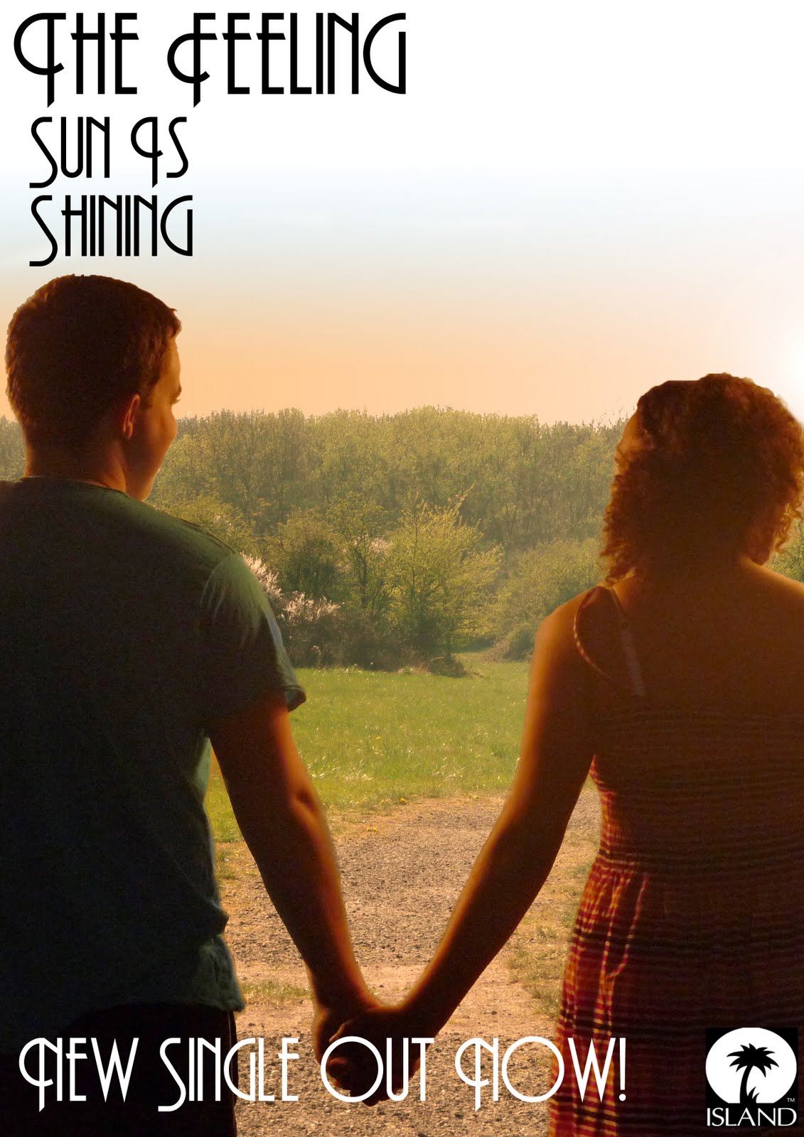
I then added the cover i constructed for the digipak by copying it from the cover file and importing it into the digipak file. I then resized it to the same size as the digipak so it is not pixelated or obviously manipulated, i also added the name of the single to the cover to complete it.
From my research i found out that the audience would like pictures, biogs, tour information and other information in the digipak, to i have done some research using The Feelings website and fansites to construct a short biog for the band to be included in the digipak. I also included information about the director or the bands music videos; Caswell Coggins, to keep continuity, as well as talking about the new album to be released later this year, which increases the interest for the band.
This is the finished inside digipak -
I now need to design the CD label,
click here to see my designs. I downloaded a template from the same website as the digipak (duplication.ca).
I created 3 overlay layers that i can use to measure the size of the label and so i dont go over the bleed line.
My first design was the one of the feelings neon logo, so start i changed the colour overlay of the large circle to black, as the background colour for this design was black. This also keeps the continuity between the digipak and the magazine advert.
I then copied the neon logo that i created for the digipak and pasted it onto the CD label using the selection tool.
The one problem with using this logo on the CD label is that the trim size of the disk doesnt allow printing in the light grey area on the middle of the disk. This then cuts out the bottom of the logo.
I then added the name of the single to the label, using the same font and style as the other products.
This is the finished CD label (1)
The second label design was one of the band, for this i will be using the same template as before, but including the band photo from the photo shoot.
Here you can see that i am having the same problem as before with the trim of the label, as the most of the band are being cut out. One way to get around this problem is to do another photo shoot of the band members individually, or cut out each band member from the original photo (however because the band members are positioned behind each other, this wouldn't work).
I tried adding a lens flare to make it look like some light was glowing from the label, however it would have to be layered on a rasterized fill layer on top of the other content, blocking out the rest of the label.
The third CD label includes the same picture as the cover, as this links the video and the digipak together, keeping the continuity between the texts. I copied the image from the CD cover file and pasted it in the label file. I then used the rubber tool and select tool to remove the excess image from the label (i also changed the opacity of the large circle so that i can still see the size of the CD label).
I then layered the colour label on top of the template to give me the final product. The image is not disturbed by the trim of the CD so it fits very well.


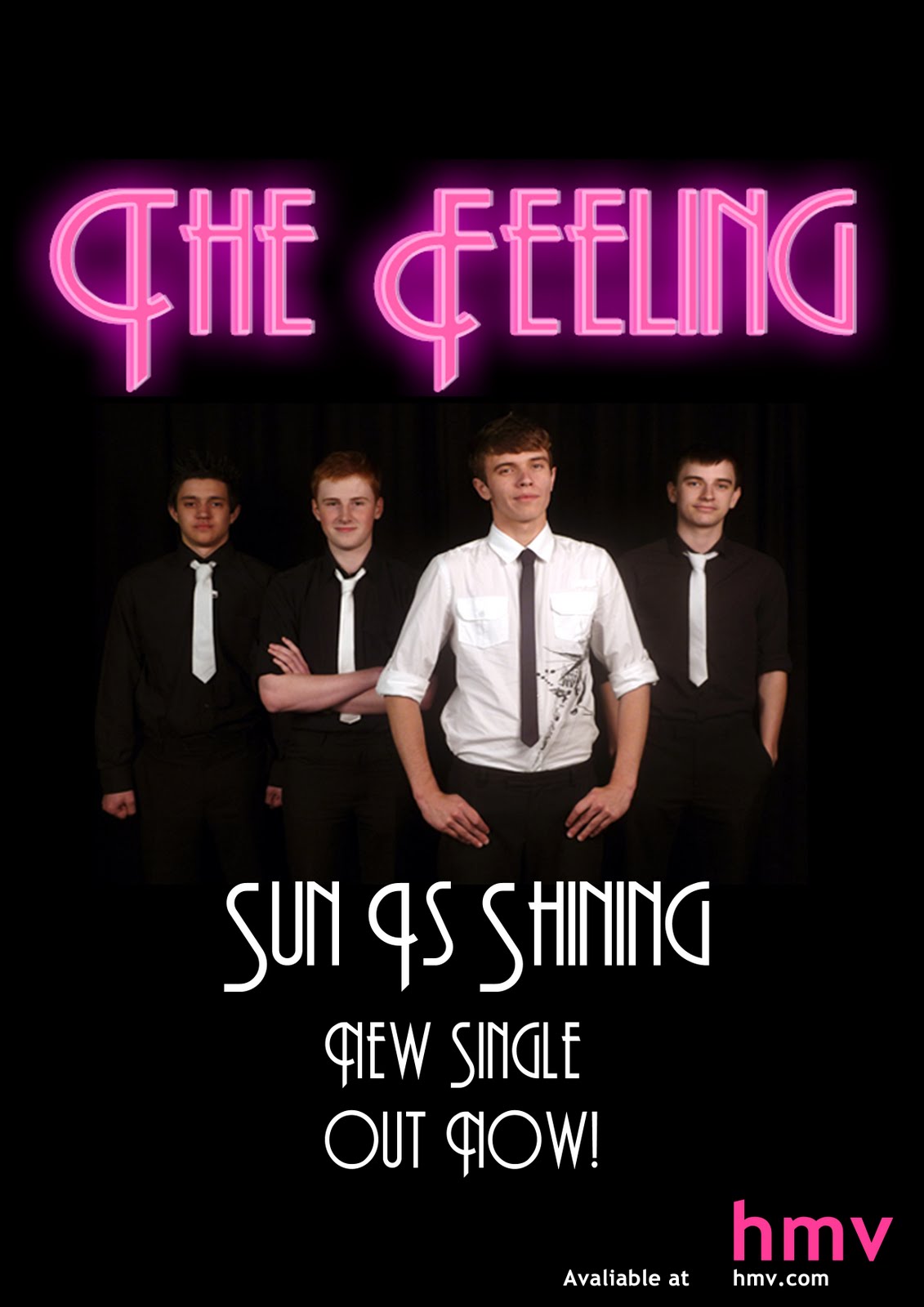


 Most of The Feelings photos have a similar style; the members of the band are layered in front and behind each other, also the clothes that they wear are very smart, it makes the band look professional. The audience have commented that they like the way The Feeling dress because it is unique, it makes the band look professional. I would like to implement both these styles into my photo-shoot; the band will be wearing black and white shirts with white skinny ties and jackets. This gives them the same smart style of The Feeling, which is what i want in my digipak - to move away from the pop art style of covers and make the bands products much more band orientated, so they are easily recognized by not only their music, but also by their style and image.


